Detroit Pistons Rebrand
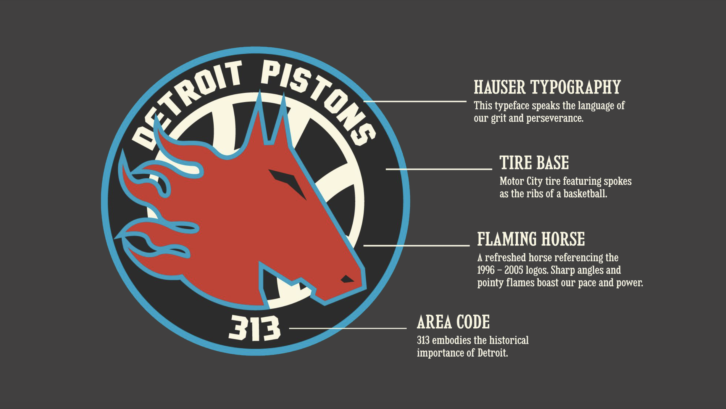
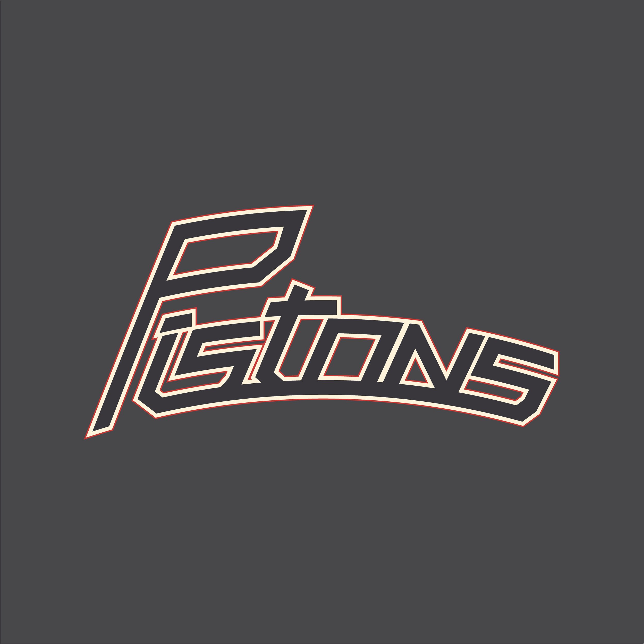
For a collaborative project with two of my peers, Blake Rupp and Gideon Kellenbarger, we were tasked with developing a comprehensive system of interrelated applications based on investigative research of an organization and its intended audience. We were allowed to choose which organization we wished to rebrand, and as a group, we thought the Detroit Pistons were due for a rebrand, given that their last rebranding occurred in 2017. With this rebrand, we aimed to recreate the feeling of the 1996-2001 brand identity and establish a new identity that would infuse new life into an upcoming young NBA team.
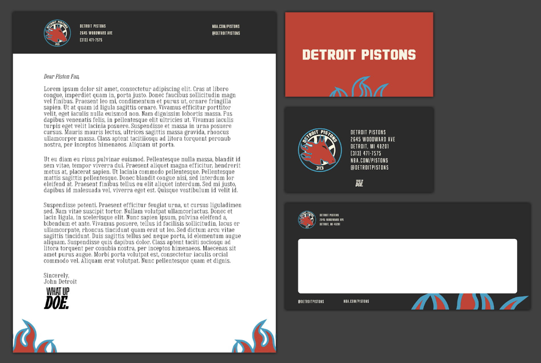
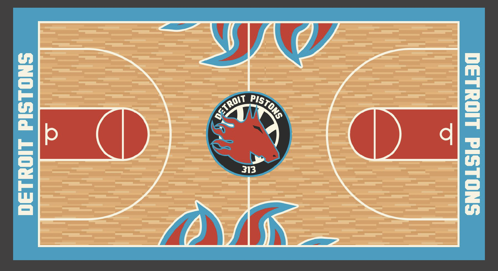
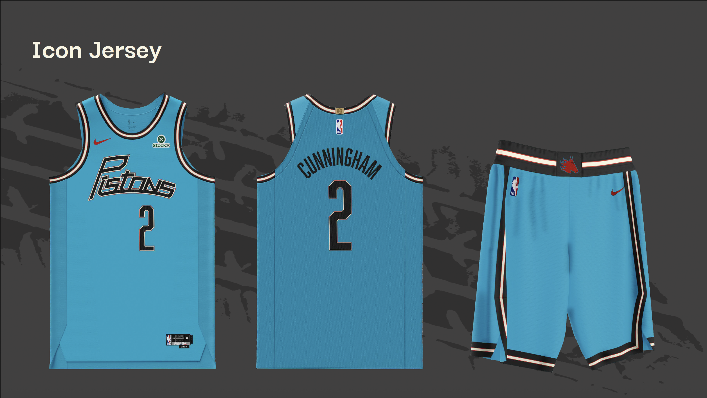
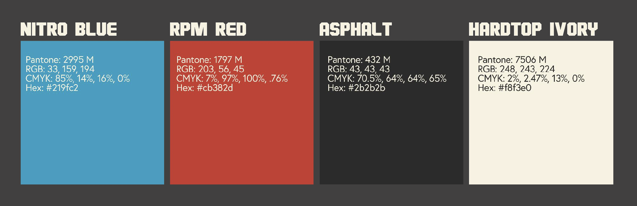
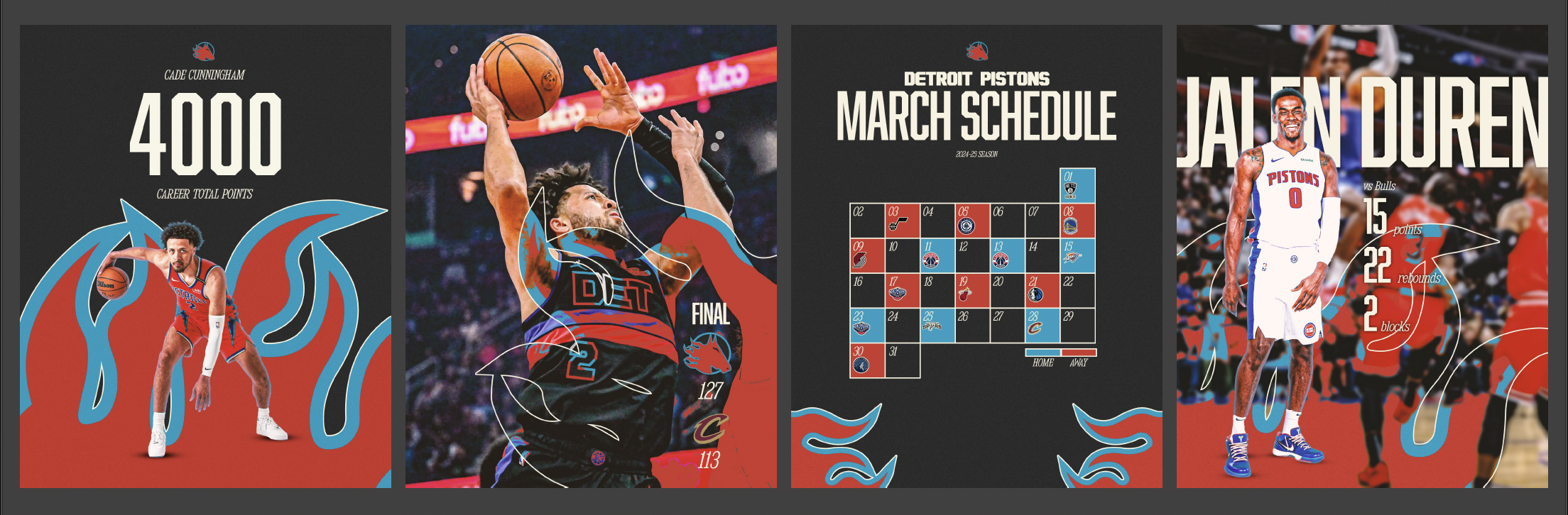
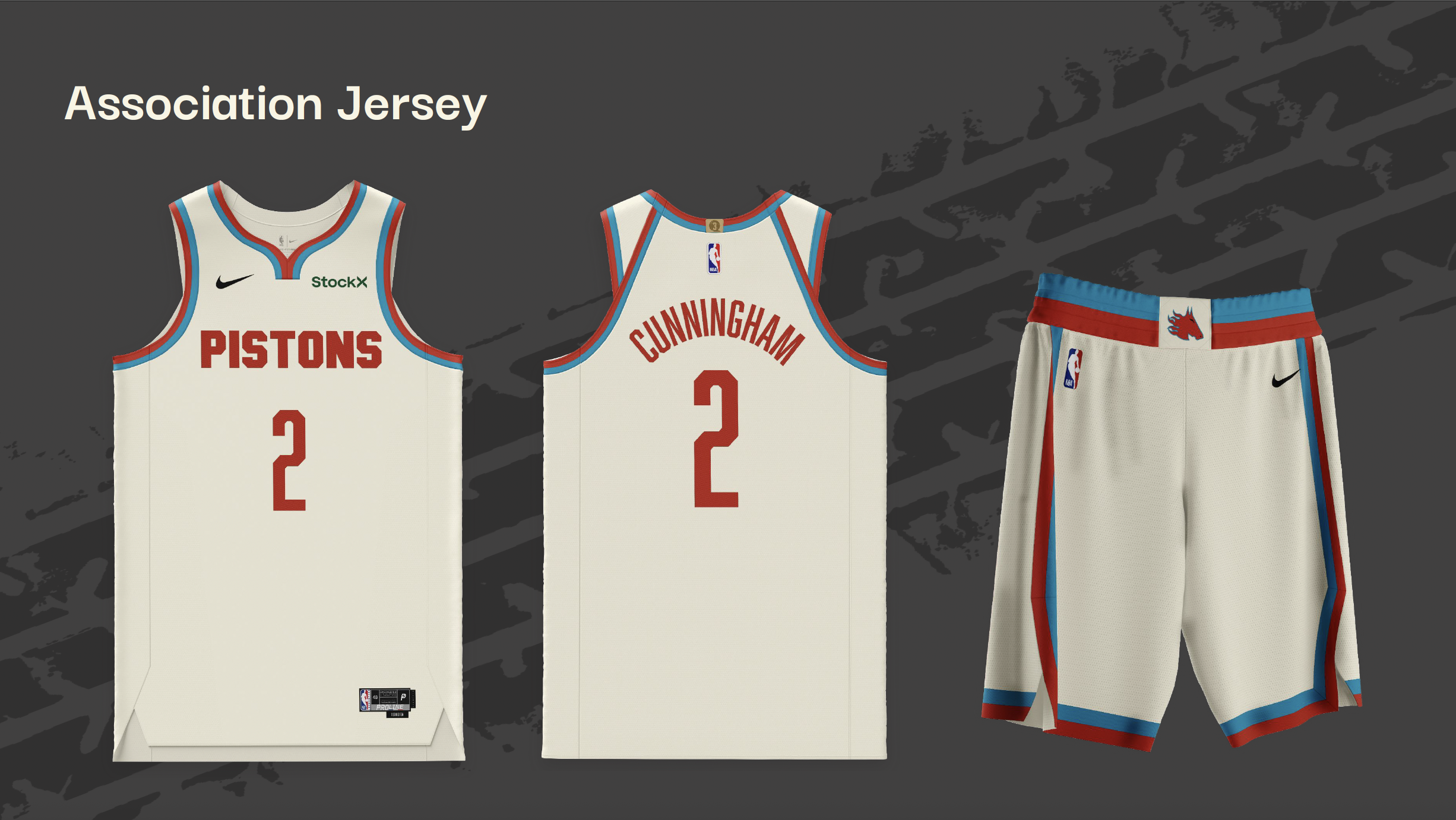
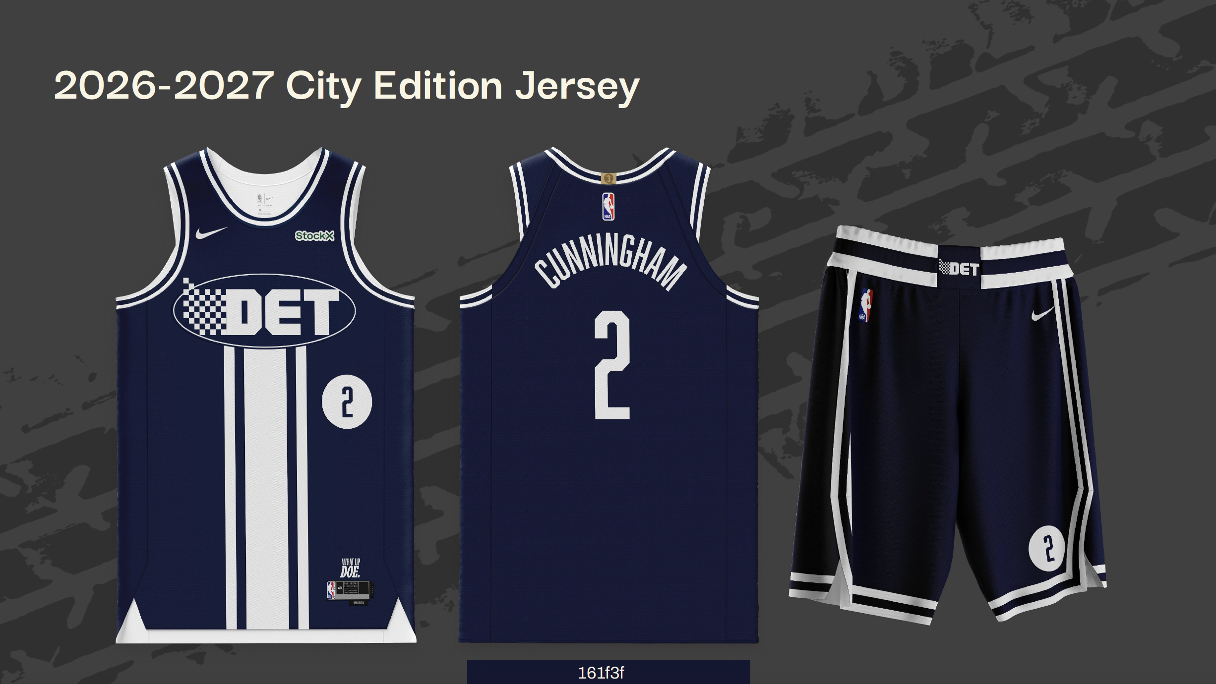
During our rebranding process, we had to make several key decisions that would shape the direction of our work, such as our main logo design, color palette, and typography. We also needed to determine which designs to create within the timeframe we had, considering that a basketball organization has many components to its brand identity. Ultimately, we developed a logo, color palette, wordmarks, a stationery set, social media graphics, a court design, jerseys, and merchandise.
The work was divided among the three of us, but we all contributed to shaping the rebrand. Each of us played a role in creating the main logo. I primarily focused on designing the home (white) and alternative (black) jerseys. Blake worked on the main and away jersey (teal) wordmarks, the away jersey, and the merchandise. Gideon was responsible for the stationery set, social media graphics, the court, the city jersey (dark blue), and its wordmark.